You can change the default display of existing forms in KIRIM.EMAIL based on your preference. Please follow these instructions to change it..
- Go to aplikasi.kirim.email page.
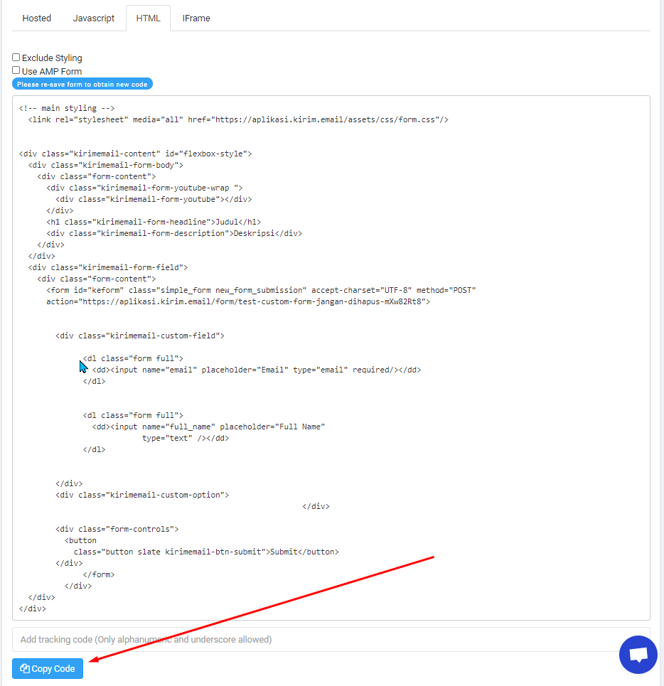
- Create a new form or edit an existing one. Make sure the form status is ON. In the DESIGN, click the HTML tab.
- Copy the available codes.

- Open https://codepen.io/pen/ and paste them to the HTML column.

- Change the layout by clicking Change View button. Select the HTML codes on the left and the display on the right as in the following image.


Adding Tag <style>
After you move the codes, now add the following codes:
<!-- Enter the styling codes in the following bracket -->
<style>
  // Enter styling codes here
</style>
after </div> code at the bottom..
So you will see the result as in the following image:

Knowing the Anatomy of Form
Before we make a custom styling form, it is good to get to know what the anatomies of the form are. It will work to create selector with the custom styling that you want.


Basically there are only two consisting anatomies of KIRIM.EMAIL’s form, such as:
- Header
- Content.
As for those in the Content, there are 3 parts :
- Field
- Input
- Button.
These are 5 Elements we’ll use to create custom styling forms.
Selector Source Code
Once you know the position and anatomy of the form, then grab the following selector source codes that suit your needs.
For instance you’d like to replace the header section, you’ll just need to copy the codes for the header and paste them on the tag <style> section.
Here are the following codes:
/* Selector for the header form section */

#flexbox-style .kirimemail-form-body {
        background-color: unset;
        color: unset;
}
/* Selector for the content form section */
#flexbox-style .kirimemail-form-field {
background-color: unset;
}/* Selector button */
#flexbox-style .button:not(.zmb).slate {
background: #2d86c2;
box-shadow: 0 0 0 1px #2d86c2;
}/* Selector button when tapped by a mouse cursor (hover) */
#flexbox-style .button:not(.zmb).slate:hover {
background: #ca9146;
box-shadow: 0 0 0 1px #ca9146;
}/* Selector field / input box*/
#flexbox-style .kirimemail-custom-field dd {
padding: 5px;
}/* Selector input */
#flexbox-style .kirimemail-custom-field input {
padding: 20px;
height: 100% !important;
width: 100% !important;
}Here are some descriptions for the properties often used for styling on the form.
- background-color = Background Color
- color = text color
- box-shadow = shadow color and its size
- margin = width of the outermost space of the element
- padding = width of the innermost space of the element
- height = element height
- width = element width.
Usage Examples
#flexbox-style .kirimemail-form-body {
background-color: #32a895;
color: black !important;
}
If styling does not give you any effects, you can use additional code !important as in the example above. Width and height uses size units of px, for example: margin : 24px.
If you have finished with the custom styling please copy the codes and embed it into your website page.
Complete.